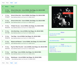
I updated my toy Spotify app. The display of each tune is simpler and only 10 tunes are displayed per page. Click any tune to see more details in the popup sidebar. The sidebar has a picture of the album cover and hyperlinks to the artist, album, and track pages on Spotify. Click the track link to play the tune immediately.
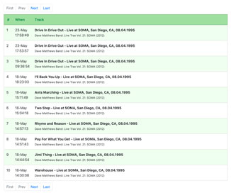
There are no other changes beyond the appearance and interaction. I have plans. Real soon now.
By the way, these are tunes I actually played. I guess that’s the purpose here. Tell me what you think. Give me music recommendations too. Always welcome.
Back to coding
My return to coding continues into the fourth month. It started with our family lockdown and the pause of my consulting gigs. I still love developing software, still enjoy the challenges, learning tons, still improving.
I started feeling the strong urge to program about 2 years ago. In January 2019 I had some time to dip my finger in, but paid work intervened. With lockdown and no current consulting gigs, I decided to dive back in. It’s been awesome. An amazing, limitless intellectual challenge.
Getting immersed in coding has also created new connections with my son Harry and daughter Emma. Harry is completing his first year in Computer Science at the University of Bristol. We talk about code, algorithms, and REST API. Emma is an interactive designer and front-end programmer. She’s my backstop on CSS, P5, D3, and good design taste.
Sophie is building her digital marketing expertise. That’s Alice’s domain.
Reflecting on Flexbox
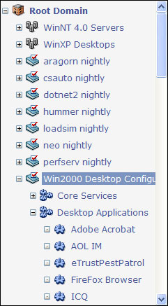
The popup sidebar is the biggest part of the new update. All browser popups are implemented manipulating CSS styles and/or HTML code while a page is on-screen. In 2007, I developed a JavaScript-based outliner at start-up Determina. Expand and collapse were implemented by simply showing and hiding DIV tags.
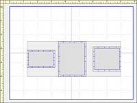
Today’s browsers support flexbox, which is a game-changer that makes everything easier. With flexbox, I can make the list of Spotify tunes consume up to 100% of the available space. The sidebar is fixed width. If the sidebar is hidden, the tunes list occupies the entire width. When the sidebar is displayed, the tunes list shrinks to make room. Look at the two screenshots.
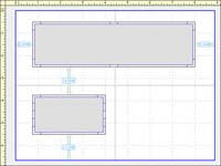
With flexbox, objects can be aligned, distributed in various ways, and collected into rows or columns with wrapping. It’s not hard to see how Pinterest layouts can be implemented with just a few flexbox rules. Striking resemblance to an app I developed and licensed to Apple in the 1990s when I wasn’t skiing.
Beyond Spotify
I’ve started a second development project, but too early to discuss. I’m also poking around two early-stage startups. This Spotify app has been relegated to weekends. We just finished May Bank Holiday Weekend which always coincides with Memorial Day in the States. I am publishing an update before I return to my ‘new normal real world’ later today.
One more thing. It’s May 26 and the New York Mets are undefeated.
